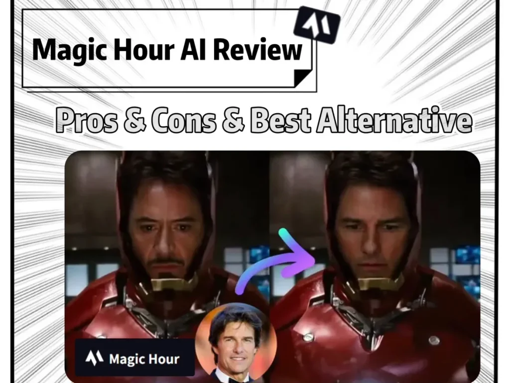
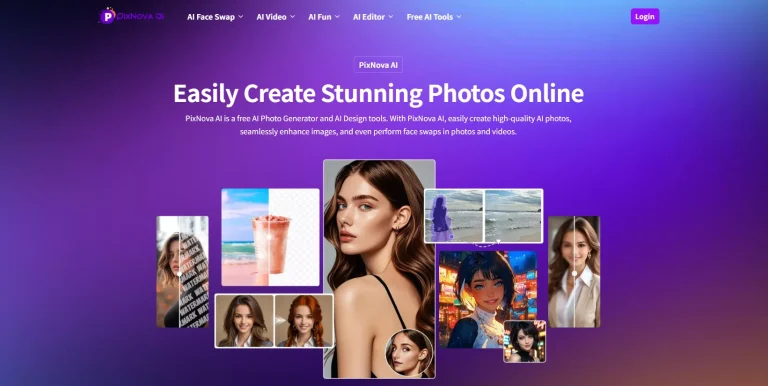
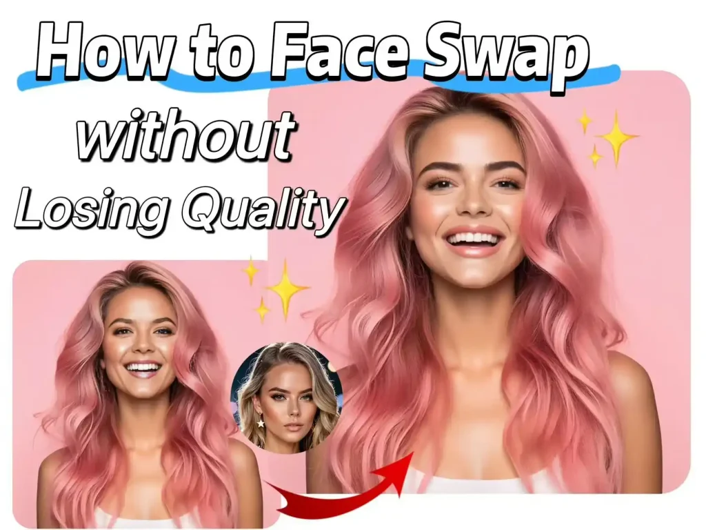
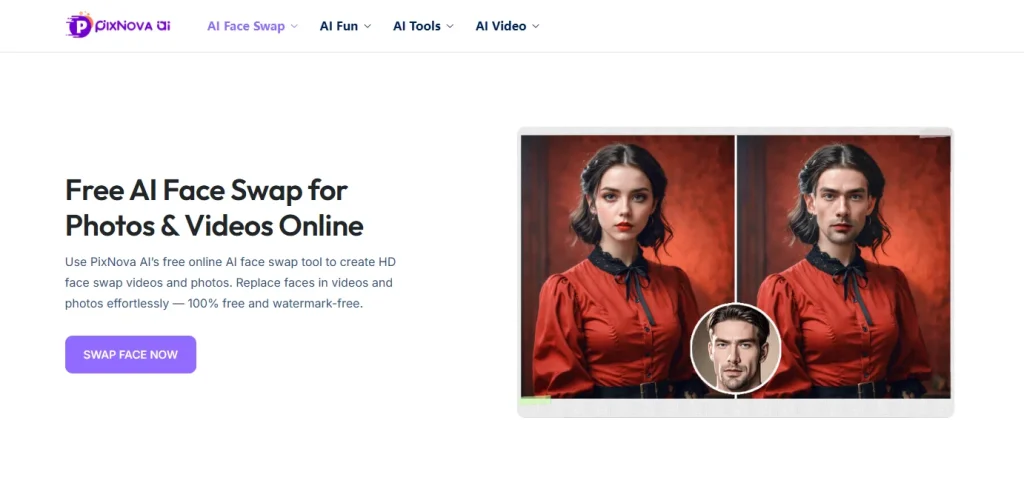
GPT Image 2 Full Review (2026): 48-Hour Stress Test, Prompts, and Workflow Hacks
Summary: I spent 48 hours pushing the new chat gpt image model to its breaking point. The verdict? GPT Image 2 finally fixes text rendering and feature bleeding, making it a powerhouse for UI mockups. But it still struggles with 3D physics and strict safety filters. This review breaks down my exact prompt formulas, the engine’s blind spots, and my actual workflow for dropping these raw PNGs straight into an AI image to video workspace to animate them before hitting publish.
Does the chat gpt new image model actually hold up for daily commercial production? I just spent the weekend running over 50 prompts through GPT Image 2 to find out.
To be honest, I almost gave up after the first few tries. The default outputs looked incredibly boring. But once I dug into the parameters, it clicked. The short answer? The GPT Image 2 text rendering is finally usable. It nails the exact spelling on bold poster titles almost every time. I can finally skip the annoying step of exporting to Photoshop just to fix typos.
It’s definitely not flawless though. I noticed it generates distinctly plastic-looking leaves if you try organic nature shots. But if you only need text-heavy mockups or e-commerce backgrounds, this engine actually gets the job done. Here is my raw breakdown of what works, the exact prompts I’m using, and a massive pitfall you need to avoid.
The Good: What Surprised Me in Actual Production
I didn’t bother with the official demos. I just dumped our weekly content calendar into the prompt box and burned through a chunk of API credits. Here is what I actually found useful:
It finally gets typography right (mostly)
I used to think you had to use specialized design tools for UI mockups, but this model handled a cluttered e-commerce layout surprisingly well. It got the main header, the subtext, and even the tiny button copy right without scrambling the letters. I literally generated a promotional graphic, downloaded it, and it was ready to post.
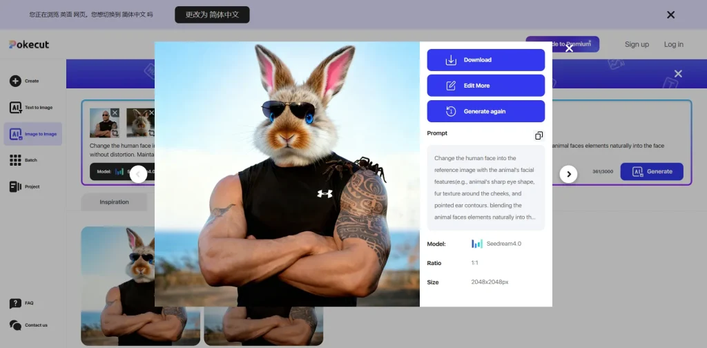
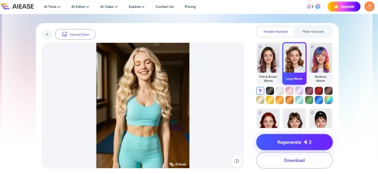
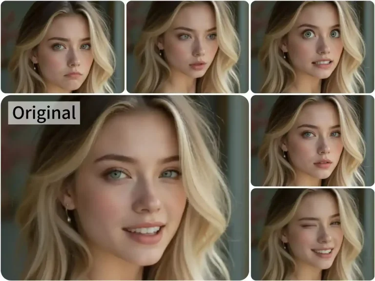
The character consistency is a lifesaver
If you run a faceless channel or do short-form video, this is huge. I locked the seed parameter and forced it to generate a 3×3 storyboard. I expected the facial features to drift, but it kept the geometry and clothing identical across different camera angles.
Strict Parameter Obedience
Older generators used to ignore half your prompt. I fed this model a dense constraint test: a red apple strictly on the left, a blue book on the right, under warm candlelight. It followed the exact spatial placement instead of just randomly blending the concepts together.
The Stress Test: GPT Image 2 Examples & Prompts
I didn’t want to just type “draw a cyberpunk city” and call it a day. To see if the chat gpt new image model is actually powerful enough to replace a human designer’s initial draft, I built a brutal, 8-step UI/UX testing framework. Let’s see how it handled the pressure.
Phase 1: Core Interface & Typography
If you want to know how to use GPT Image 2 for professional mockups, you have to start with the basics that usually frustrate designers the most: text and UI styles.
● Test 1: Flawless GPT Image 2 Text Rendering
- The GPT Image 2 Prompt: “A modern high-fidelity UI design for a fintech mobile app login screen. In the center, a prominent glowing button with the text “Quick Pay” written exactly on it in a clean sans-serif font. Above the button, a bold header says “Welcome Back”. Dark mode with subtle neon blue accents.”
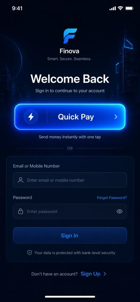
The Verdict: Absolute pass. No misspelled words. No alien glyphs. It nailed the sans-serif font and kept the neon blue strictly as an accent without bleeding it into the white text.
● Test 2: Understanding Real UI/UX Trends
- The Prompt: “A smart home dashboard web interface designed strictly in a frosted glassmorphism style. Semi-transparent glass cards with background blur, hovering over a fluid gradient background of vivid purple and bright orange. White minimalist icons for lighting and temperature.“
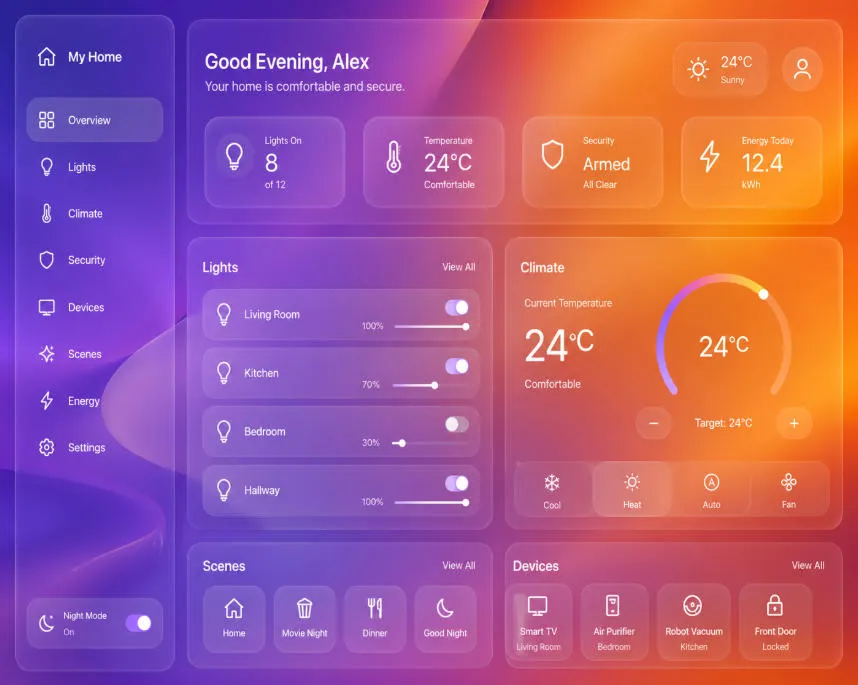
- The Verdict: I was skeptical, but it didn’t just paint a grey box. It actually rendered the background blur behind the semi-transparent cards.
Phase 2: Spatial Logic & Feature Isolation
This is where older versions of any chat gpt image generator usually completely break down by mixing up left, right, and colors.
● Test 3: Exact Spatial Placement
- The Prompt: “A top-down flat lay view of a designer’s minimalist desk. Place a white ceramic coffee mug on the top left corner. In the exact center, a silver tablet displaying a colorful line chart. Resting on the bottom right corner of the tablet is a yellow fountain pen.”
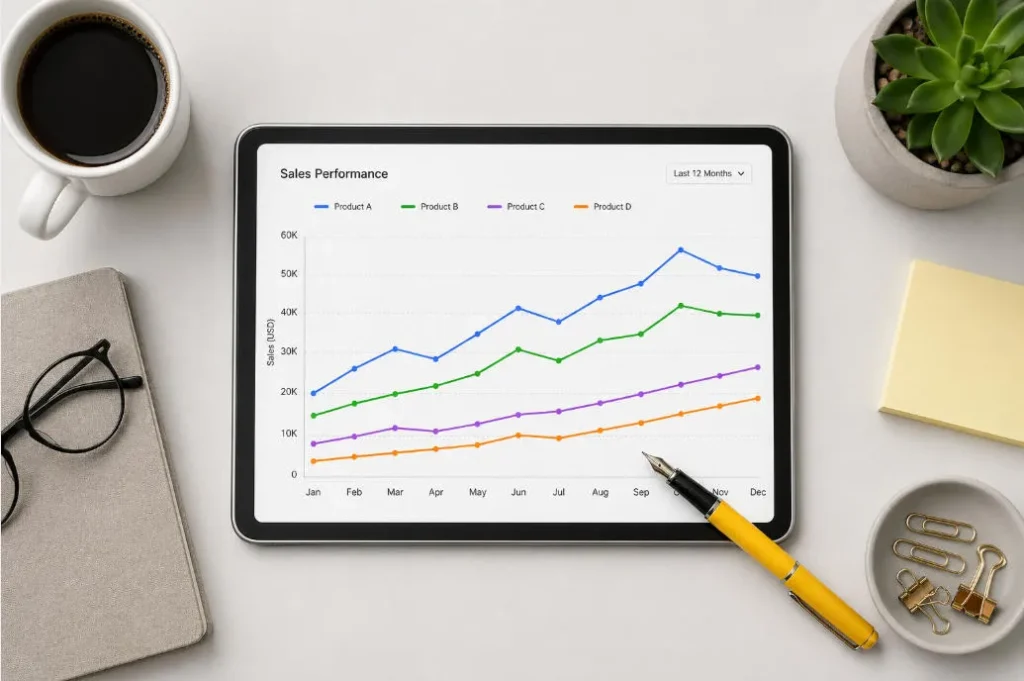
- The Verdict: It followed absolute positioning perfectly. The mug stayed top-left, the pen stayed bottom-right.
● Test 4: Complex Attribute Binding (No Bleeding)
- The Prompt: Three distinct 3D app icons lined up in a row on a white background. Far left: a red apple with water droplets. Middle: a blue geometric wolf head. Far right: a golden metallic gear.
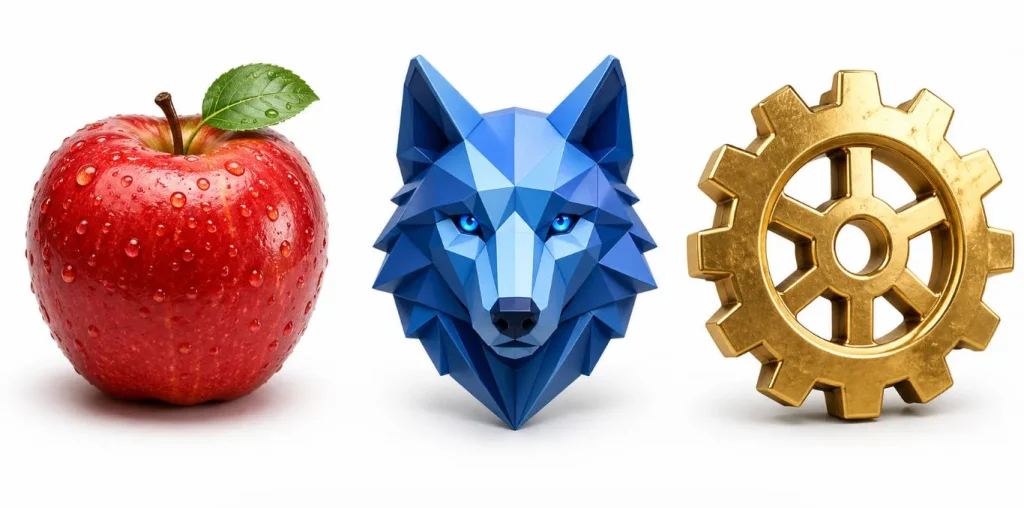
- The Verdict: This is the classic “feature bleeding” test. Looking at most AI generations, they will make the gear blue or the apple metallic. Here? Zero bleeding. The wolf stayed geometric and blue, the gear stayed gold.
Phase 3: Physics, Depth, and The Details
For the final push, I generated a few more complex GPT Image 2 examples to test cinematic fidelity and check if the model drops details.
● Test 5: Material & Lighting Physics
- The GPT Image 2 Prompt: A macro close-up shot of a physical UI toggle switch. The base plate is matte black plastic. The movable switch is highly polished brushed aluminum reflecting light. Next to it, a tiny glowing green LED indicator light.
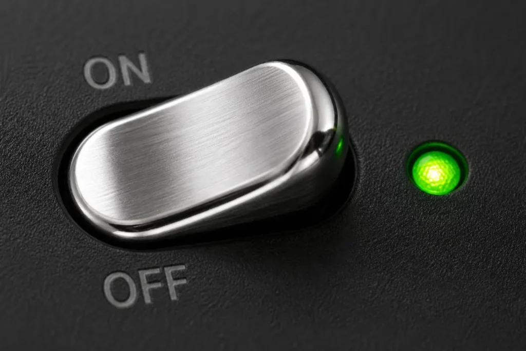
- The Verdict: The contrast is what shocked me. You can clearly see the dull, light-absorbing matte plastic versus the sharp metallic reflections. You can even see the green LED bouncing a realistic physical glow onto the aluminum switch.
● Test 6: Layering & Depth of Field
- The Prompt: An ultra-wide 16:9 web hero banner for an artisanal coffee brand. Extreme depth of field. In the blurry extreme foreground, rich dark roasted coffee beans. Sharp midground: a minimalist glass pour-over coffee maker. Highly blurred background: a brightly lit cafe interior.
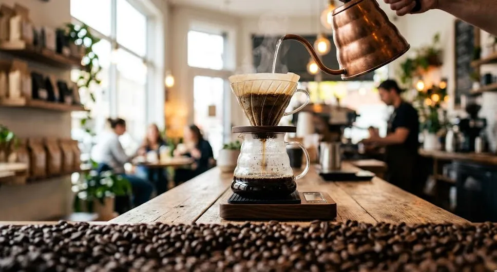
- The Verdict: Generating a blurry foreground object is notoriously hard. It handled the Z-axis depth perfectly, keeping the viewer’s eye strictly on the sharp midground coffee maker.
● Test 7: Abstract Concept Visualization
- The Prompt: A high-end conceptual 3D illustration representing “Seamless User Onboarding and Data Security”. A glowing ethereal padlock effortlessly morphing into a smooth, flowing silk ribbon. Trust blue, vibrant cyan, and clean white.
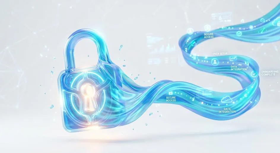
- The Verdict: Client briefs often have these weird abstract requests. Instead of a cheesy stock photo, it elegantly blended the “padlock” (security) and the “ribbon” (seamless flow) into one cohesive 3D asset.
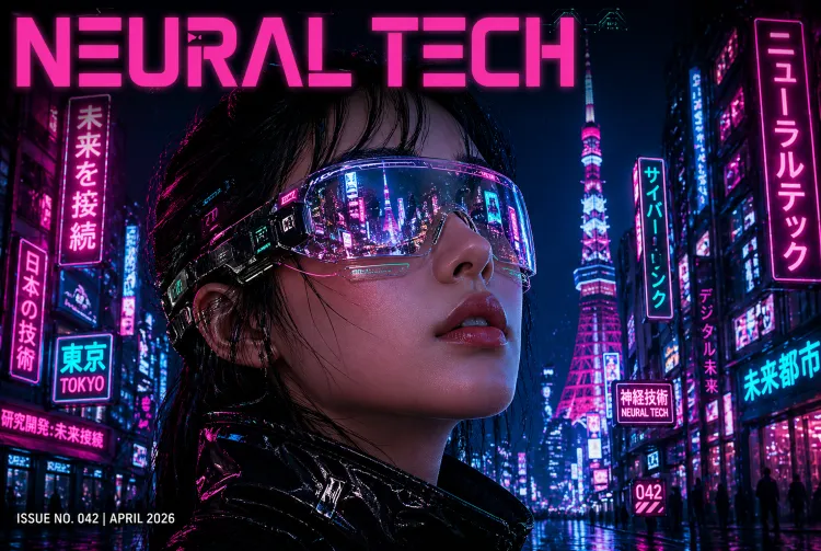
● Test 8: Granular Bug-Hunting
- The Prompt: A highly detailed cyberpunk woman avatar. She is wearing futuristic AR glasses. Crucially, the lenses are reflecting glowing green lines of code. She has an intricate geometric hexagon tattoo explicitly on her left neck. She wears a yellow high-collar jacket.
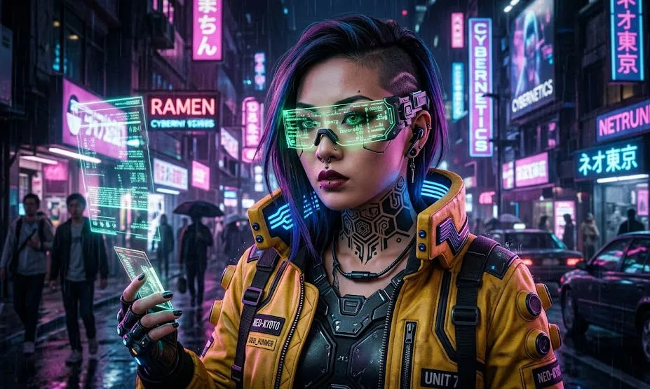
- The Verdict: I checked this output like a QA tester looking for bugs. Left neck tattoo? Yes. Yellow high-collar? Yes. Green code specifically in the reflection of the glasses? Yes. It didn’t drop a single parameter.
I learned the hard way that vague sentences still produce garbage. To get professional outputs, you have to stick to a rigid formula:
[Medium/Format] + [Subject] + [Exact Text in quotes] + [Environment] + [Lighting/Camera].
Other prompt word test works
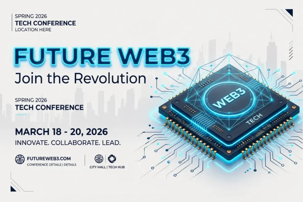
(1)The Layout Challenge (For Marketers)
Can the model handle multi-line text and specific layouts without scrambling the letters?
- The Prompt: “A striking Spring 2026 city poster for a tech conference. Clean off-white background. The main title reads ‘FUTURE WEB3’ in bold, neon-blue typography. Below it, a smaller elegant subtitle reads ‘Join the Revolution’. A minimalist 3D rendering of a computer chip sits in the center. Aspect ratio 9:16.”
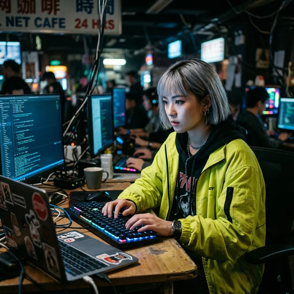
(2)Character Consistency (For Social Media Creators)
Will a character look identical if prompted in different environments?
- The Prompt: “A cinematic medium shot of a young Asian female hacker with a short silver bob haircut and a neon-yellow jacket. Sitting in a dimly lit cybercafe, typing on a glowing keyboard. Soft blue monitor light reflecting in her eyes. Ultra-realistic, 35mm lens.”
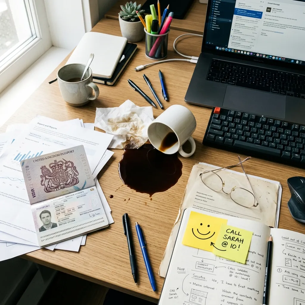
(3)The Dense Details Test
Does the model ignore instructions when the prompt gets too long?
- The Prompt: “A busy office desk from a top-down view. Include a spilled cup of black coffee, a pair of wire-rimmed glasses, a yellow sticky note with a smiley face, and an open passport. Bright morning sunlight from the left.”
The Reality Check: Where the Engine Breaks
Despite those wins, I wouldn’t cancel your other tool subscriptions just yet. When I pushed the model into complex technical requests, it fell apart.
- The “Plastic Foliage” Problem: Don’t use it for organic landscapes. Dense forest scenes look distinctly synthetic, lacking the chaotic texture of real nature.
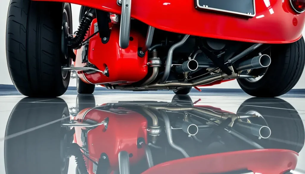
- Broken Physics Logic: It understands words, but not the physical world. I tried to force a complex water reflection with a reversed perspective, and the geometry completely fell apart. It just pastes concepts together.
The Prompt: “A classic red sports car parked on a perfectly reflective mirror floor. The camera is placed very low to the ground. The reflection in the mirror must show the complex mechanical undercarriage and exhaust pipes of the car.”
What actually happens: It will just flip the image of the car’s doors and roof and paste it underneath. The AI doesn’t understand 3D space or how a real mirror reveals the bottom of an object. It just mimics the concept of a “reflection” by mirroring pixels.
- Hyper-Aggressive Safety Filters: The compliance rules are incredibly strict now. It will instantly block your prompt if you try generating anything close to a copyrighted IP. I wasted a dozen API calls just trying to figure out where the safety line was drawn.
The Final Verdict: Actually Worth the Hype
So, after throwing everything but the kitchen sink at this engine across multiple dimensions, what is the real takeaway?
I’ll be straight with you: yes, the physics break sometimes. But this model is genuinely fantastic. It is an exceptional foundational tool. Whether you are running a full production team, or just an enthusiast messing around with AI for the first time, it is absolutely worth trying out. The raw visual fidelity it pulls off will legitimately amaze you.
Don't Leave Your Assets Static (My Actual Workflow)
And that brings us to the reality check we need to talk about. A perfectly spelled, high-resolution UI mockup is still just a static PNG. If you just post that flat image on a modern social feed, it won’t attract attention.
Once I get a clean output from this model, my workflow doesn’t stop. I immediately grab that raw generation and drop it straight into a workspace to add motion. It takes an extra 30 seconds, but it transforms a dead poster into an engaging asset. Here is exactly how I process these files to hit daily upload targets.
Step 1: Fix the hallucinations first
Got a perfect layout but a weird shadow in the background? Use the eraser tool provided by some AI tools to gently erase the blemishes. The image can be cleaned up in three seconds, and then the animation can be created.
Step 2: Push it to the Seedance Engine
Don’t let a good image sit still. Select the cleaned image and drop it into the Seedance video generation workspace. Because Seedance 2.0 supports multi-modal inputs, you can just apply a motion preset (like ‘Dynamic Pan’ or ‘Neon Rain’) directly to the image and render the video. The result is a richly detailed video.
Build the Pipeline in One Workspace
Executing these hacks across multiple apps kills production speed. Downloading from one site and uploading to a separate video editor wastes time and compresses your files.
You don’t need to constantly switch applications; The Pixnova workspace integrates the entire workflow. In the image generation area, you can natively generate visual assets using the GPT Image 2.0 model, instantly remove imperfections, and then apply dynamic presets to generate the video without leaving the browser. All steps are completed within the same environment, resulting in extremely high efficiency.
Final Summary
GPT Image 2 solves the hardest problems in AI visual generation—typography and complex prompt logic. It delivers high-fidelity raw materials and deserves a core spot in your production process. Test it for your next visual campaign.
Just remember: a static PNG rarely holds attention on modern feeds. Adopt this model to generate top-tier assets, but pair it with a fast video pipeline to actually scale your output and hit your daily content quotas.
Frequently Asked Questions
How to use GPT Image 2 effectively?
Stop using vague keyword dumps. Build prompts using a strict parameter-level formula: [Subject/Action] + [Text Elements in "quotes"] + [Environment] + [Lighting/Camera Settings]. Be exact about camera angles and film types. For maximum engagement, never leave the output static—drop the final image into an AI image to video workspace to animate the scene.
What is GPT Image 2 and why is it trending in 2026?
Released in April 2026, it is the newest native model powering OpenAI’s visual generation. It solves the broken typography and failed prompt logic issues of previous generations. It serves as the ideal foundational generator for text-heavy marketing assets and concept art before you push them through secondary video pipelines.
Can I use a chat gpt image generator for commercial projects?
Yes. Outputs generated via official APIs and paid subscription tiers grant full commercial rights. Generate product photography, UI mockups, and digital ad creatives instantly. Scale them into dynamic video ads without paying traditional stock photo licensing fees.